Medical cannabis is legal in 28 U.S. states. The American Cannabinoid Clinics was founded by a family of doctors known as the Knox family, aka the CannaMD's. They are globally recognized as experts in the field of medical cannabis.
They were interested in having a brand that represented their existing footprint. They are licensed to practice medicine in 18 states, and were invited to present their findings to the United Nations in 2017.
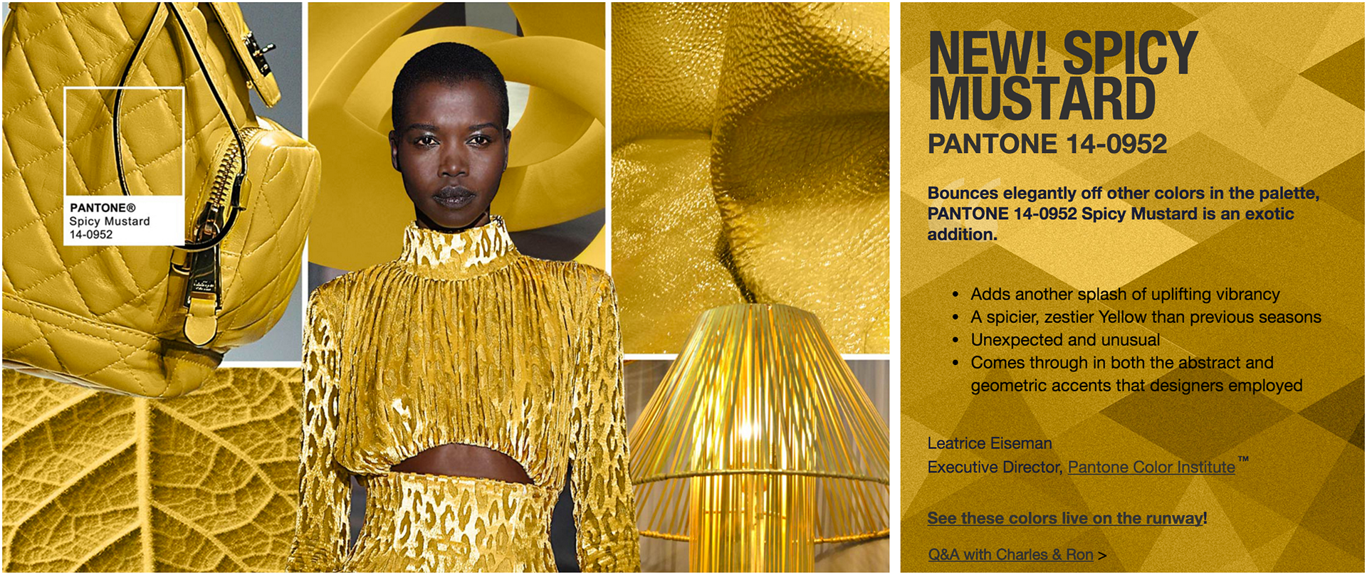
We started the research and discovery phase by looking back at the history of cannabis in America in the early 1900's. There was an intention to use a font that felt like it not only came from that era, but also 'felt' american.
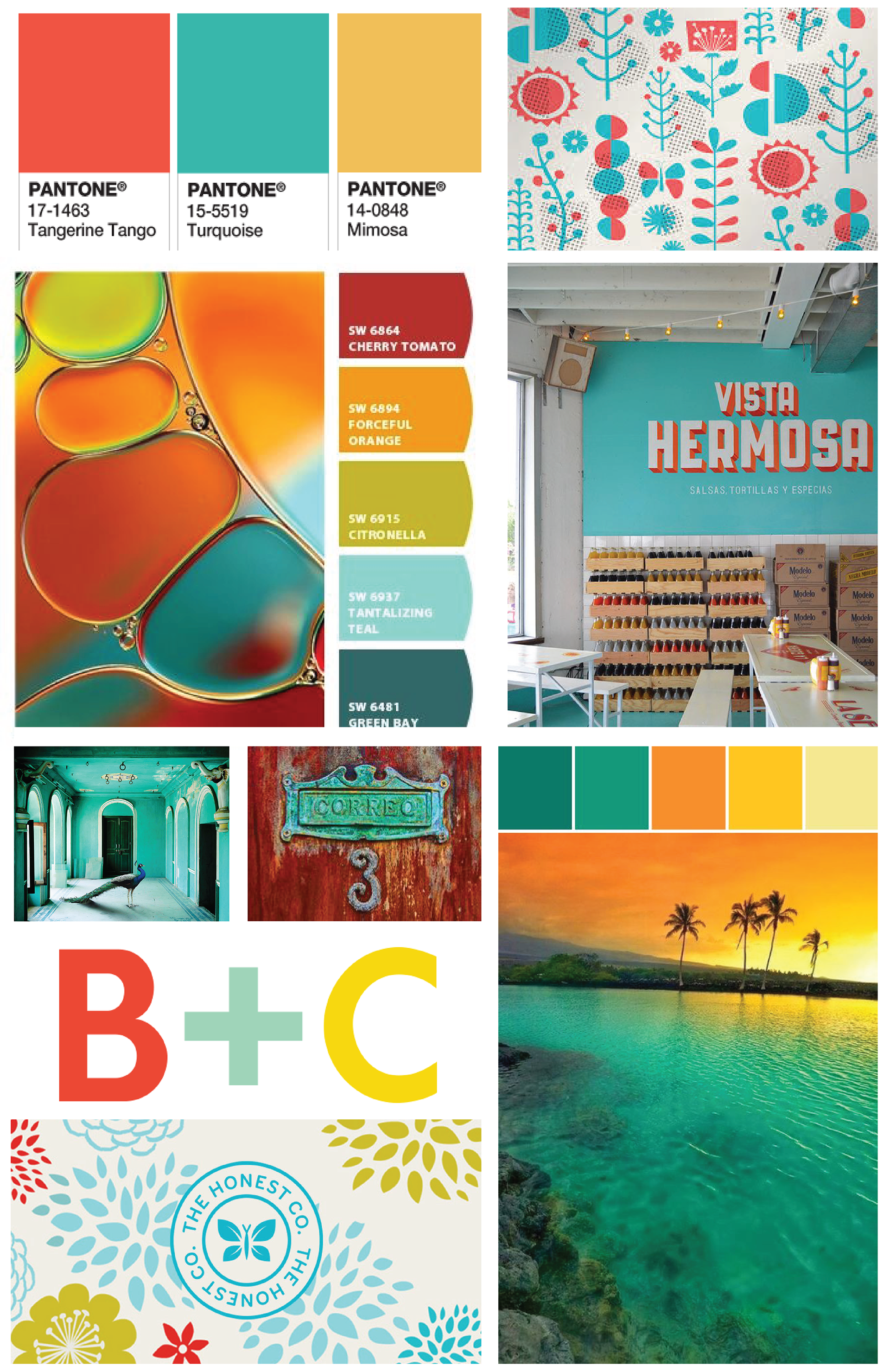
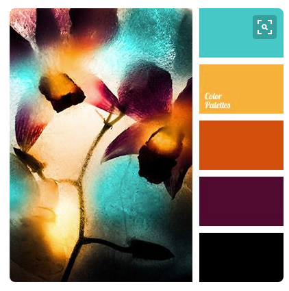
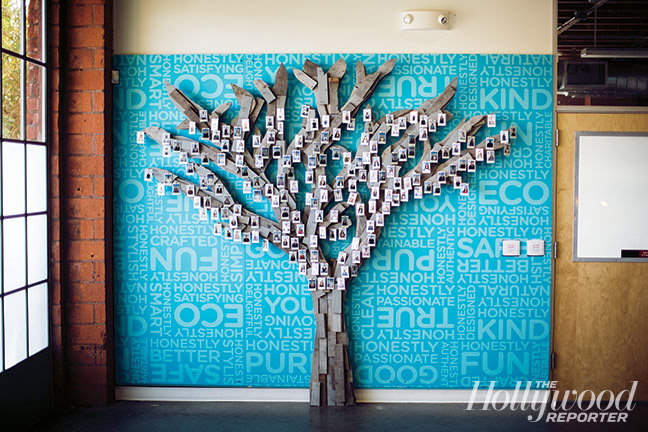
We also explored two main themes — integrative medicine and cannabinoids. Some of the inspiration images are shared below.
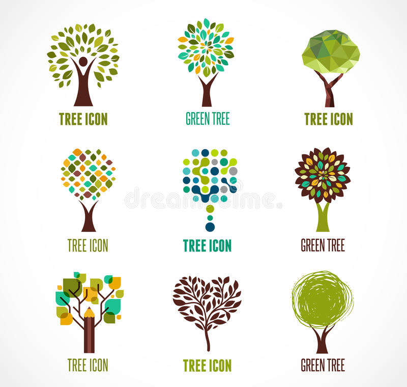
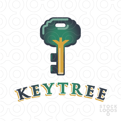
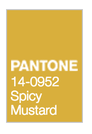
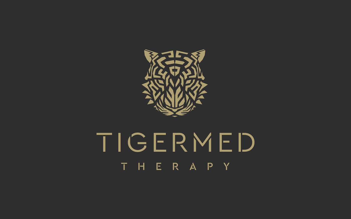
The final primary mark is the color of golden cannabis oil. It represents oil extracted from plants, not just the cannabis plant but other plants where terpenes can be found such as essential oils. The mark is a tree but it's also a drop of oil. It's easy to recognize as an avatar on a social channel or embroidered on a lab coat.
Once the doctors saw the final logo presented, they immediately said that was it. It feels like a medical brand, but it's also not too stuffy. It feel progressive, yet also timeless like it could've been on a cannabis product from 1910.