Kalapooya Fire is a high quality cannabis oil vape pen line from Eugene, Oregon. The story Kalapooya Fire wanted to tell is a nod to the native tribe that used to inhabit southern Oregon. The tribe lived near the Calapooya mountains outside of Eugene. They used fire to sustainably farm their land. The tribe would burn off the top layer of grass allowing them to dig up camas cakes, which were used as currency.
Kalapooya Fire features CO2 cannabis extraction from some of Oregon's finest sustainable cannabis growers. By working with the best growers and the best extraction method, Kalapooya Fire wanted to highlight each farm in a series of collectible vintage matchboxes.
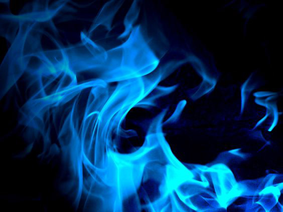
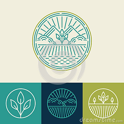
Expressing fire in a high end luxury brand is fairly challenging. Fire as am image or icon has been overused and often appears unsophisticated. We worked to represent fire on the horizon in, what we estimated to be, a unique way by using bars instead of actual flames.
The resulting logo can be applied digitally or embroidered on apparel.
The biggest challenge was the font treatment. I wanted to push the contrast between big/small and serif/sans serif. 'Kalapooya' is such a long word compared to 'fire'. It would seem easy to just stack them and call it good. But it took a while to get the right feel.
We took into consideration how it would appear as an avatar in the news feed of cannabis lovers. There was an intention to give it horizontal and vertical weight.