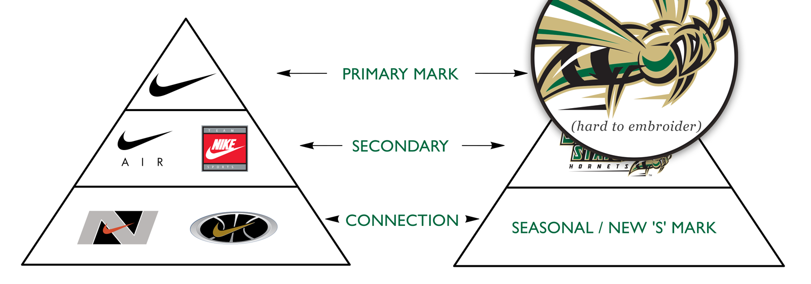
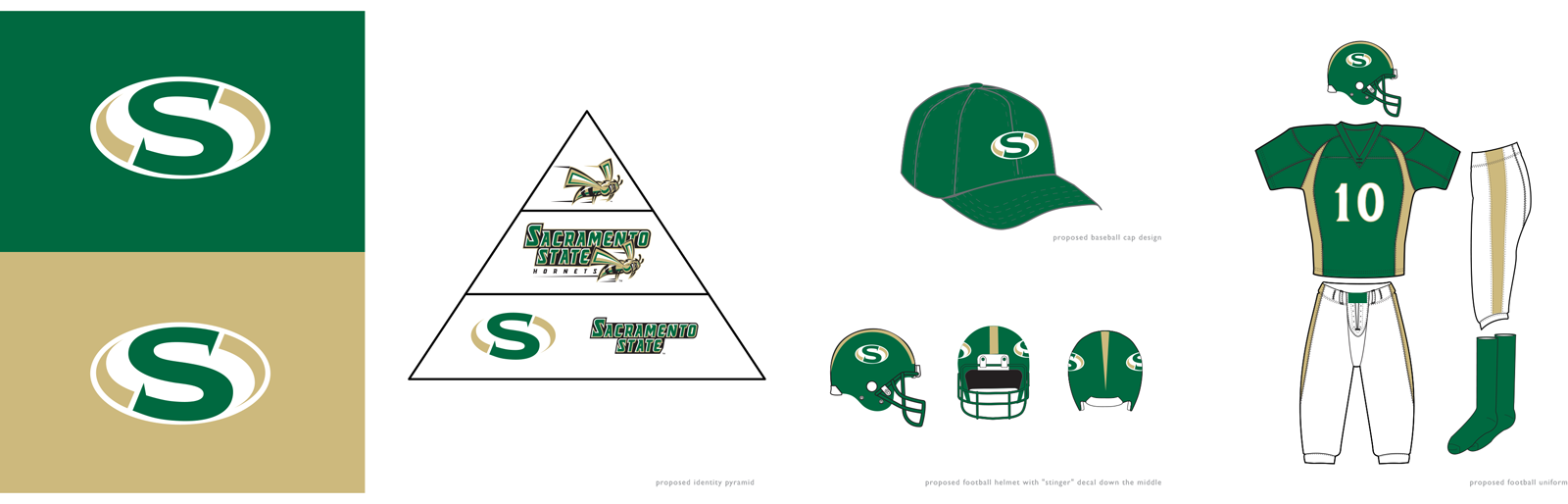
Sacramento State approached Bakas in 2004 with a desire to redraw the primary Sacramento State Hornets marks and also create a secondary ‘S’ mark based on the existing logotype to be used by the athletic department.
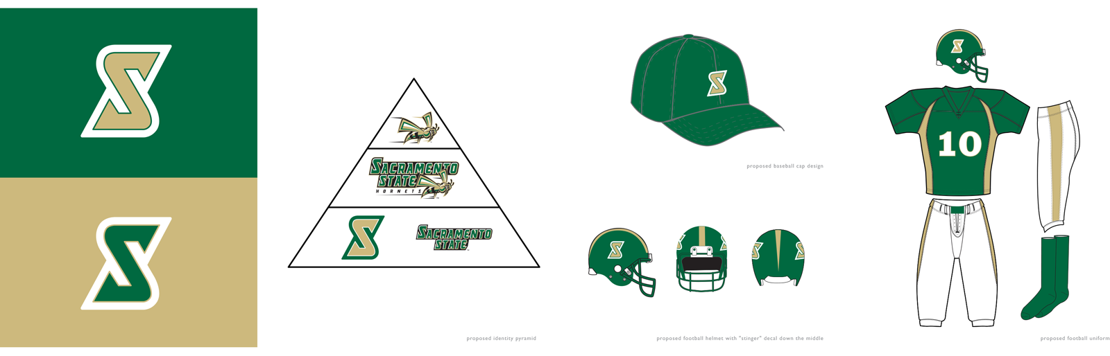
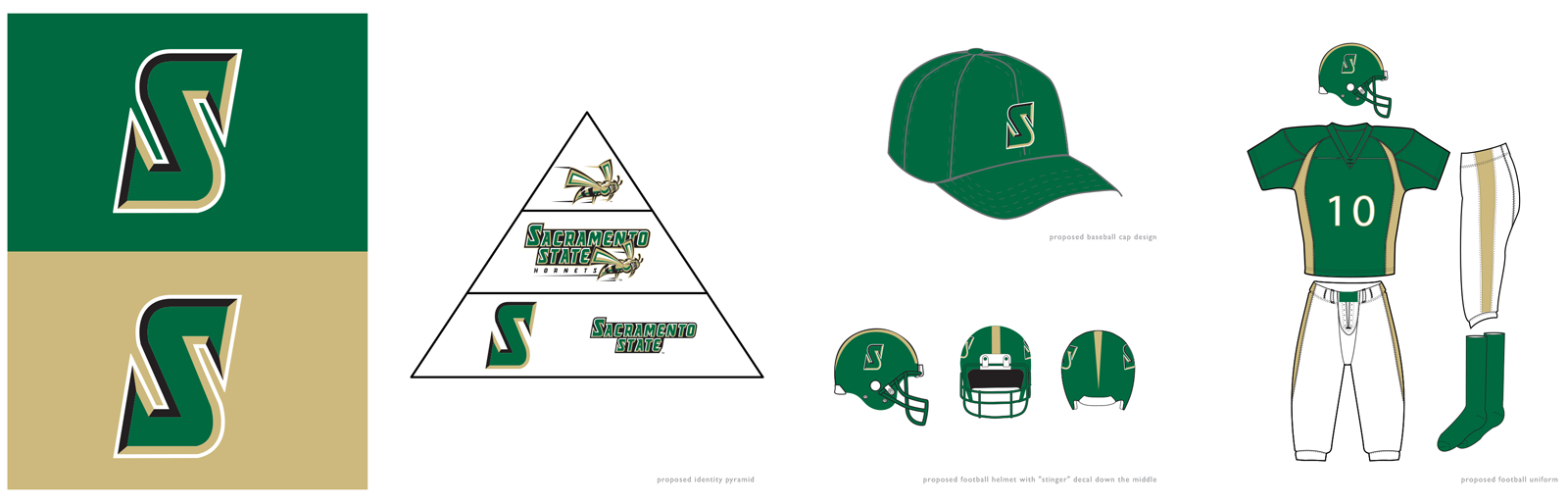
Sacramento State also requested additional exploration into brand colors, including considerations around black as a primary. Ultimately, the color scheme was untouched with the exception of deepening the richness of the green and making the gold pop more in contrast to the darker green.
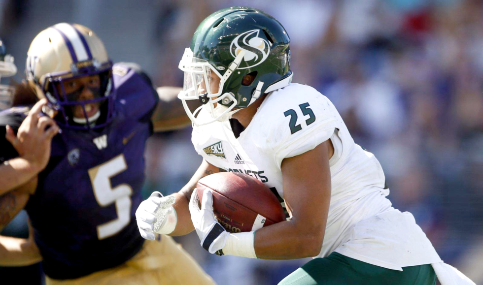
Sacramento State’s hornet logo didn’t look as sharp at smaller sizes. First order of business was to clean up the vector file and refine the hornet logo so it would look embroidered at smaller sizes. During the exploration phase of the project we looked at the predatory nature of hornets and focused on their prime create power.
We landed on a stylized ‘S’ with influences of a hornet stinger as the serif. The S-logo was initially meant to be a secondary mark, but over the years has become the primary mark used on team helmets.