Creative Director - Todd VanHorne
Art Director - Ken Black
Lead Designer - Rick Bakas
Senior Designer - Michael Scheible
Apparel Designer - David Turner
The Denver Broncos identity redesign was a dramatic departure from where the team was previously. Conversely, the New York Giants approached NIKE asking for something at the other end of the spectrum. They were interested in a subtle update to their identity.
As one of the most storied franchises in the NFL, the Giants had a rich history to draw from. We looked at how the Giants looked on field and realized their helmet and uniforms were two different blues. We worked to tighten up their color scheme and explored an italicized 'NY' that combined their old 'NY' with the italic 'GIANTS' they had on the side of their helmets at the time.
Ultimately, the team decided to go back to the 'NY' from their past. We just lightened up the colors to be more modern.
The first part of the redesign involved a full month in discovery mode. We were granted access to the NFL's Hall of Fame archives where we were able to look through the Bronco's entire history.
We uncovered a local front range Native American legend of a ghost horse of the plains. The horse was so spirited, it couldn't be tamed by man. We started exploring other uncontrollable forces in nature, like volcanoes, tsunamis and other animals like serpents.
When we finally sat down to start sketching, you can see some of the early inspirations represent serpent elements and wave type shapes.
We tightened up the story around the purpose of orange in the color scheme. Orange represents the fiery belly of the stallion, which is why the eyes ended up becoming orange. They're the windows to his soul.
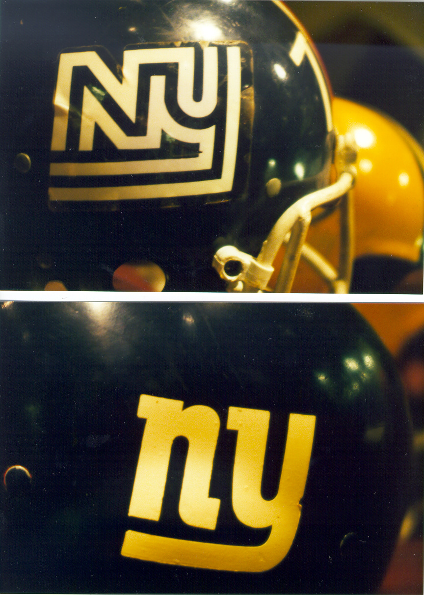


The New York Giants' updated identity brought back the look from their past with subtle updates to their uniform. We put them in the same Batwing uniform worn by the Denver Broncos but without the highlighted side stripe. We worked hard to match the uniform blue with the blue on the helmet. Previously, the blue on the helmet was much darker created a disconnected look.
At the time, the Batwing was the most advanced football uniform design on the field. Players had a better range of movement in a lighter fabric. They went on to face the Baltimore Ravens in the Super Bowl the first year in their updated look.
