Creative Director - Todd VanHorne
Lead Designer - Rick Bakas
Senior Designer - Michael Scheible
Additional Design work by Eric Bodamer
Apparel Designer - David Turner
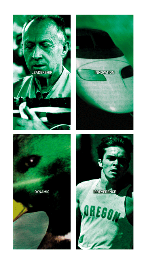
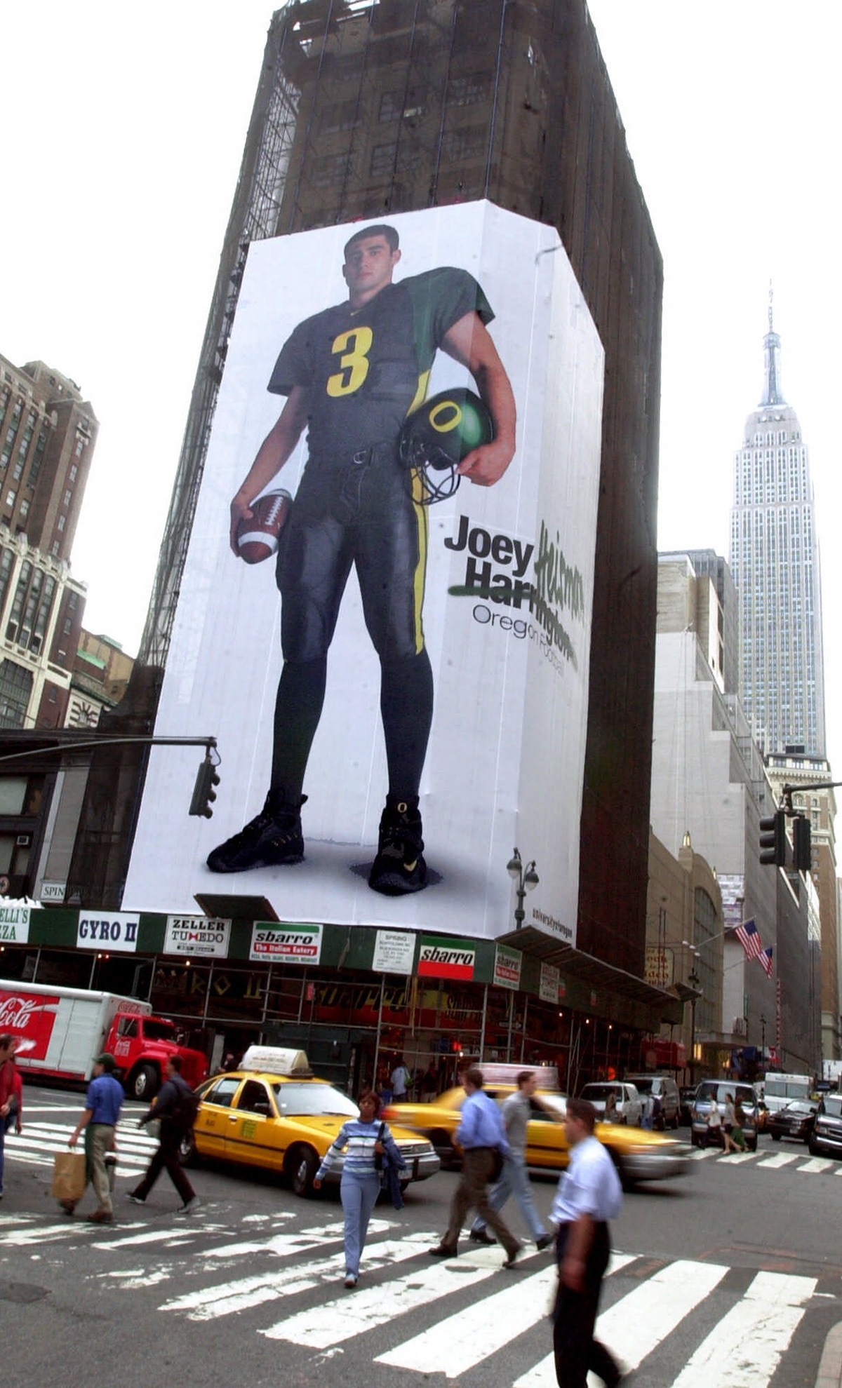
After completing the Denver Broncos identity redesign, Phil Knight approached our design team and asked for a new identity for his beloved Oregon Ducks. NIKE was born on the track at Oregon, and Knight wanted it to be a top-tier sports program.
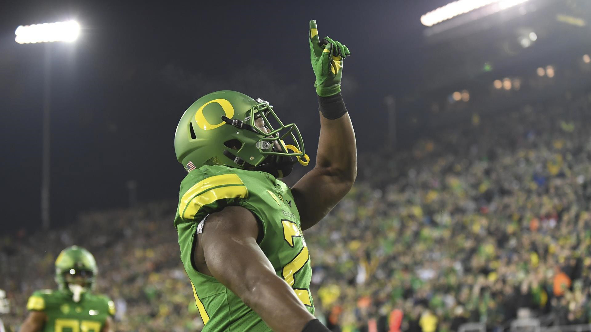
Our design team was tasked with replacing the Disney Donald Duck and interlocking UO icon with something more modern. The university was interested in attracting 5-star talent and even committed to expanding the seating capacity at Autzen stadium.
This is how the Oregon Ducks brand came to be...
The University of Oregon sits on the pacific rim. The school has a large percentage of students coming from Asia and Hawaii. As we dove into the discovery phase, we looked at technological advancements like bullet trains and other futuristic advancements from Japan. NIKE was founded on the track at Oregon by track coach, Bill Bowerman who famously poured rubber composite into his wife's waffle iron.
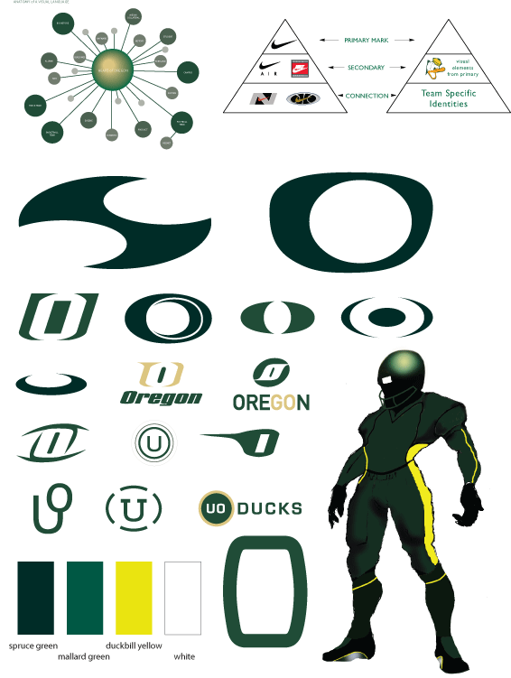
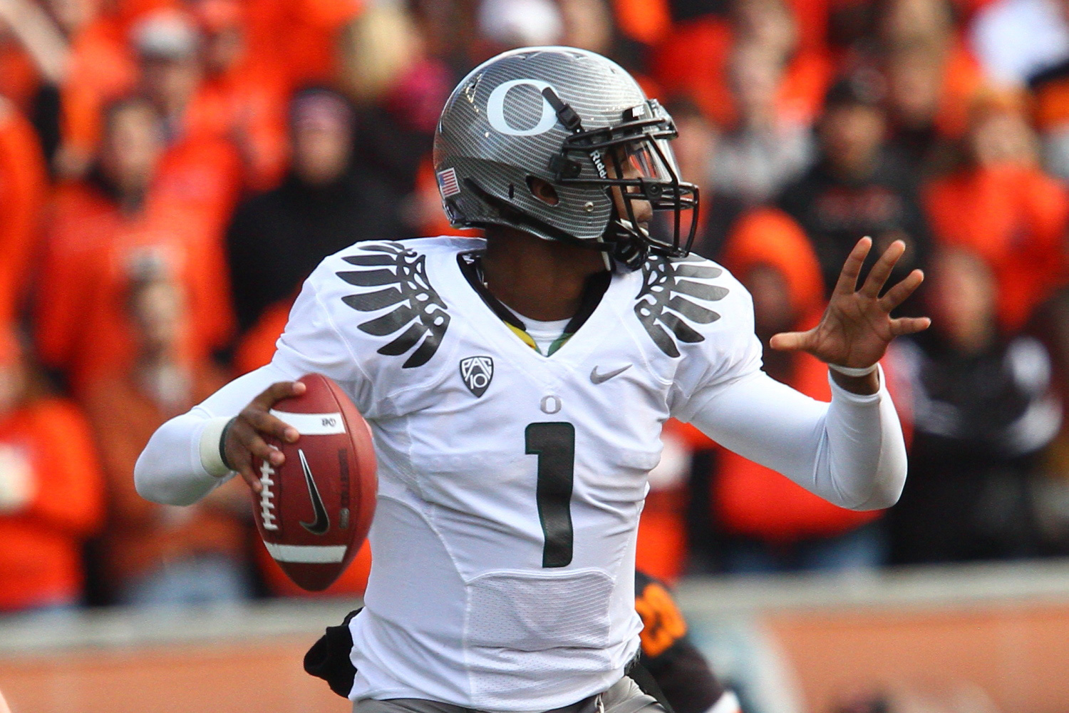
NIKE has always excelled at technological advancements in sports. We wanted the University's identity to represent the connection with sports and technology.
When we were looking at the color scheme, I had an "a ha!" moment while eating lunch out near the lake on the NIKE campus. I was staring at this mallard waddling around trying to figure how to make a duck look cool. The iridescent color of his head reminded me about Chroma-Flair car paint we had seen at the Detroit auto show earlier in the year. That's the paint that could shift color.
I started playing with the paint on helmets to see if we could get the helmet to emulate a duck's head. Sure enough, there was a green Chroma-Flair color scheme. We took the dark green and the light green from that Chroma-Flair green color spectrum, and made a dark/light green colorway out of it. We then looked at different yellows in nature. We found one with enough vibrancy to compliment the iridescent green.
While we were exploring the new primary mark, we were aware Oakley sunglasses was pretty aggressive in defending their 'O' logo or anything remotely close to it. We were going back and forth on whether to have a 'UO' or to just have a single 'O'.
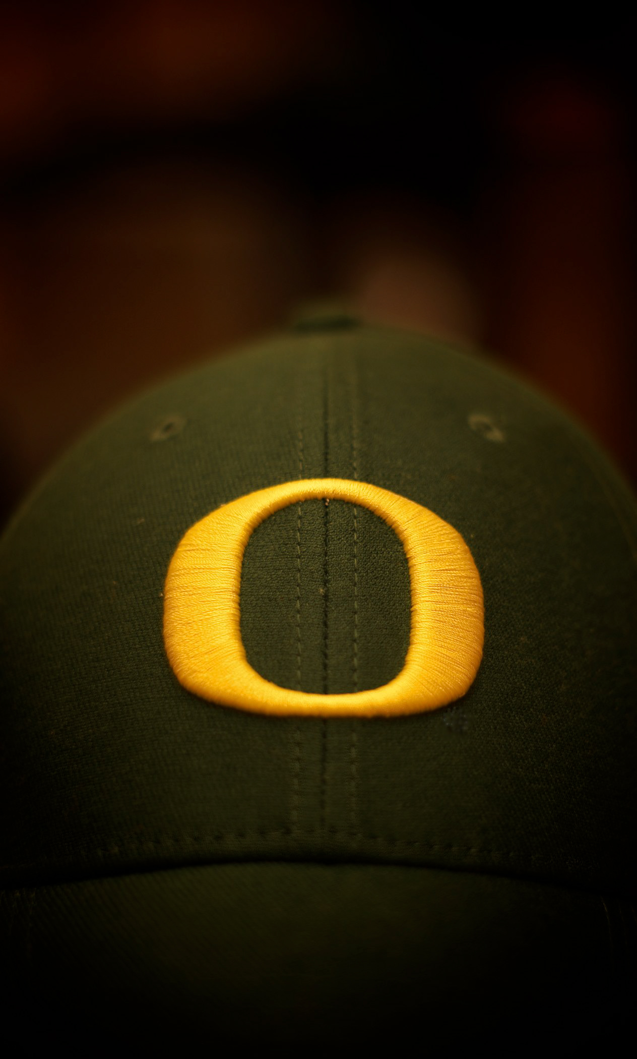
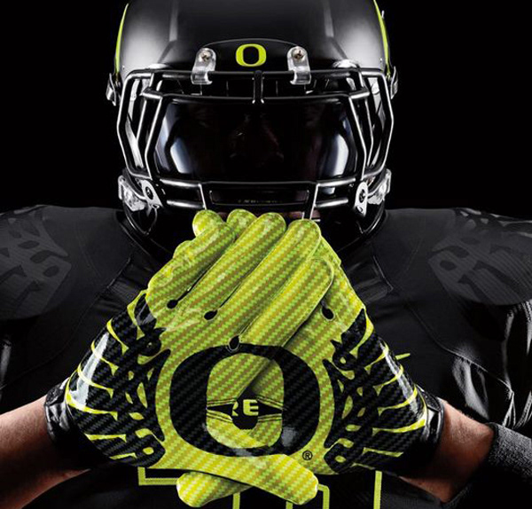
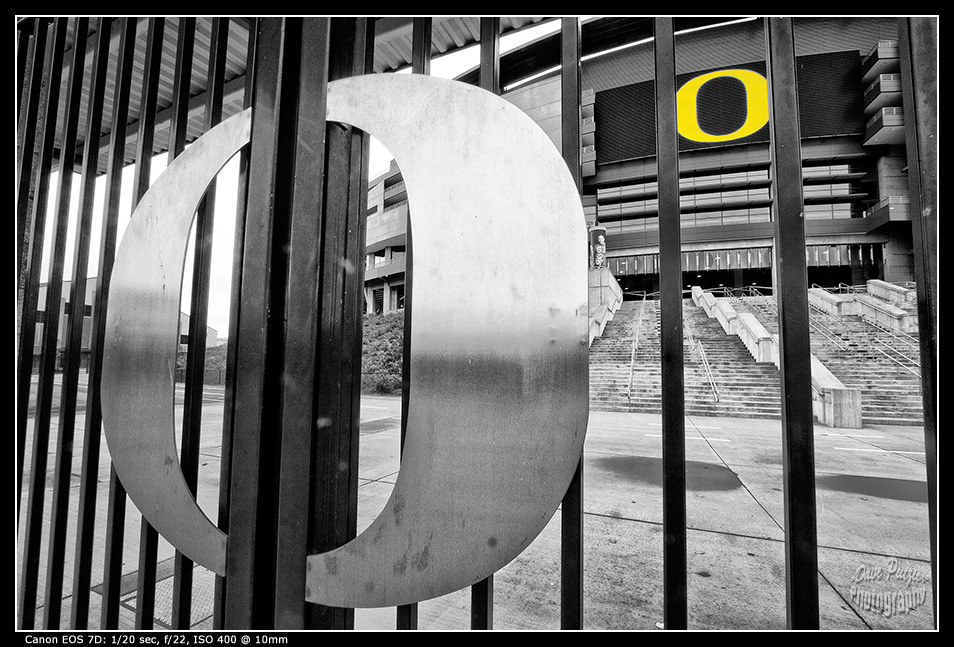
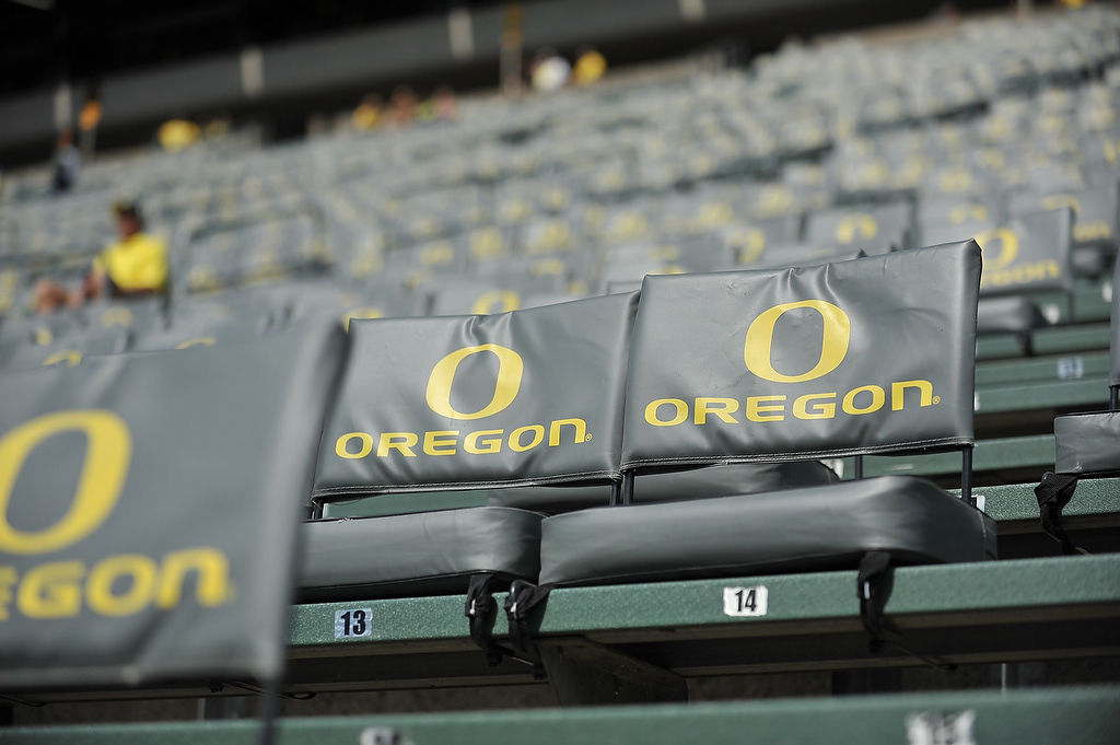
After a few months of iteration, it was late on a Friday night and I wanted to head home after a few all-nighters. Then it hit me. Out of nowhere I got this idea to take the shape of Oregon's track and the shape of Autzen stadium's footprint. When I combined them together, it created the 'O' you see today.
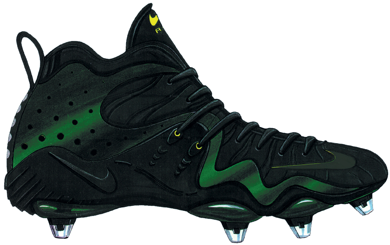
We finally had a mark that represented the story we were trying to tell. I had been working with Tinker Hatfield and Tracy Teague in the footwear division as well as David Turner, who designed a new futuristic uniform so we could have a complete head to toe representation. The football program wanted to be able to recruit high quality talent with this new futuristic look.